welcome to my court
Josephine KimProduct designer · Cornell Information Science · graduating Dec 2026
Turning Enterprise Data Into Actionable Sales Intelligence
Designing a Sales 360 dashboard that transforms complex sales, customer, order, and fulfillment data into a clear decision-making system.
The Challenge
Sales data was spread across a lot of things at once: products, customers, reps, orders, delivery, and billing.
Each of those dimensions had its own reporting surface, so understanding overall performance meant assembling a picture from separate pieces. Answering the natural follow-up question, why did a number move, required jumping between views and losing the thread of the original question.
The design problem was less about building more charts and more about structuring one analytics experience where the overview and the explanation live in the same system.
Designing the Information Architecture
Five views, going from “how's the business doing?” down to specific questions.
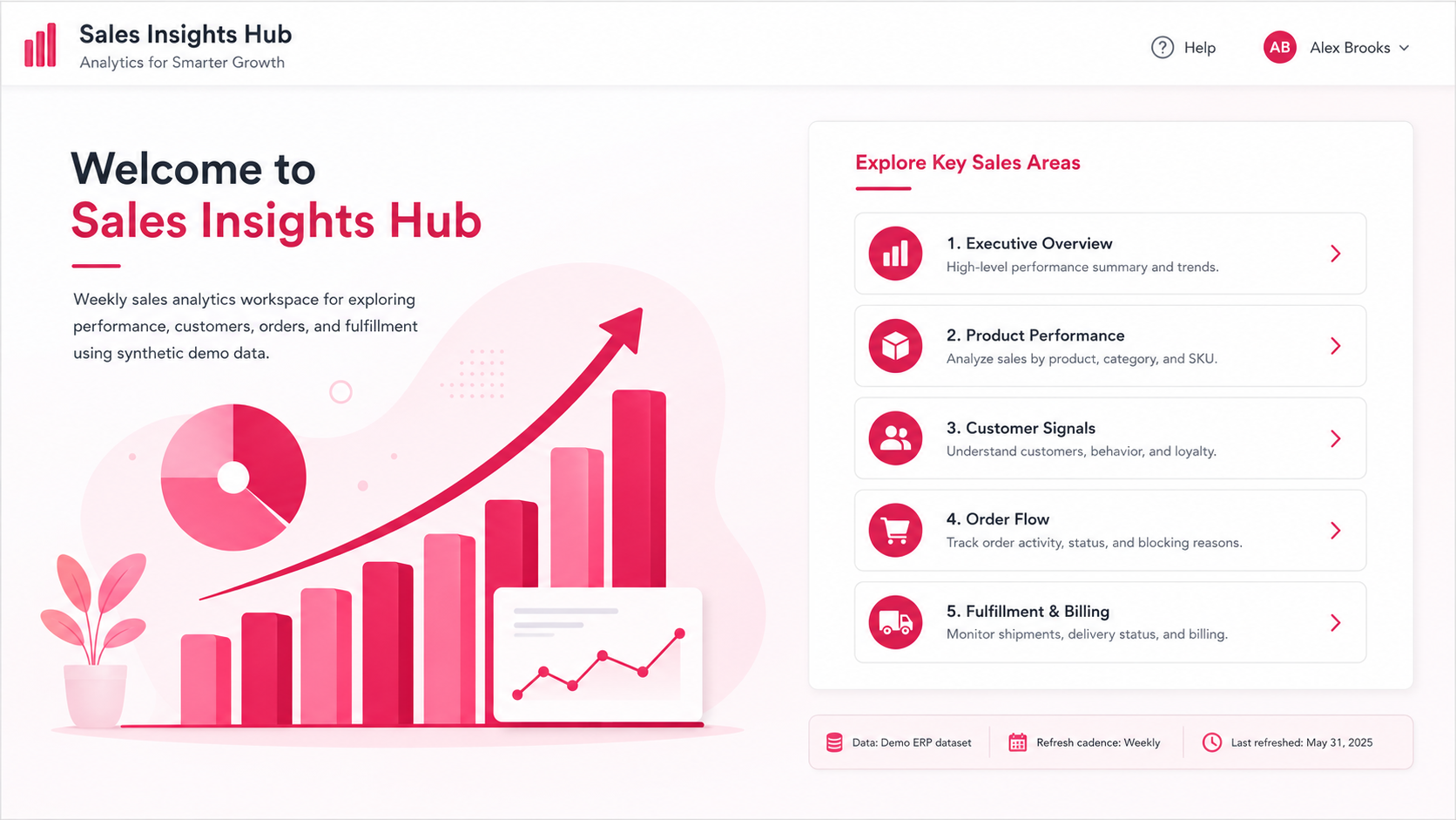
Executive Overview
Headline KPIs, sales trend, and week-over-week comparison for an immediate read on business health.
Product Performance
Top-selling products, sales trends by representative, and product and plant level filtering.
Customer Signals
Top customers by sales, customer sales trends, and purchase-frequency patterns.
Order Flow
Order creation trends and ordered versus confirmed quantity, filtered by status and rejection reason.
Fulfillment and Billing
Billing quantity by product and delivery-status breakdown, filtered by delivery block and ship-to party.
The sequence is deliberate progressive disclosure. Executive Overview answers how the business is doing, and each subsequent view narrows the question: which products, which customers, which orders, and finally what happened downstream in delivery and billing.
The dashboard is built around weekly reporting on SAP HANA data, with product-level analysis based on material descriptions.
Executive Overview
You should be able to tell how things are going in a few seconds, before you dig in.
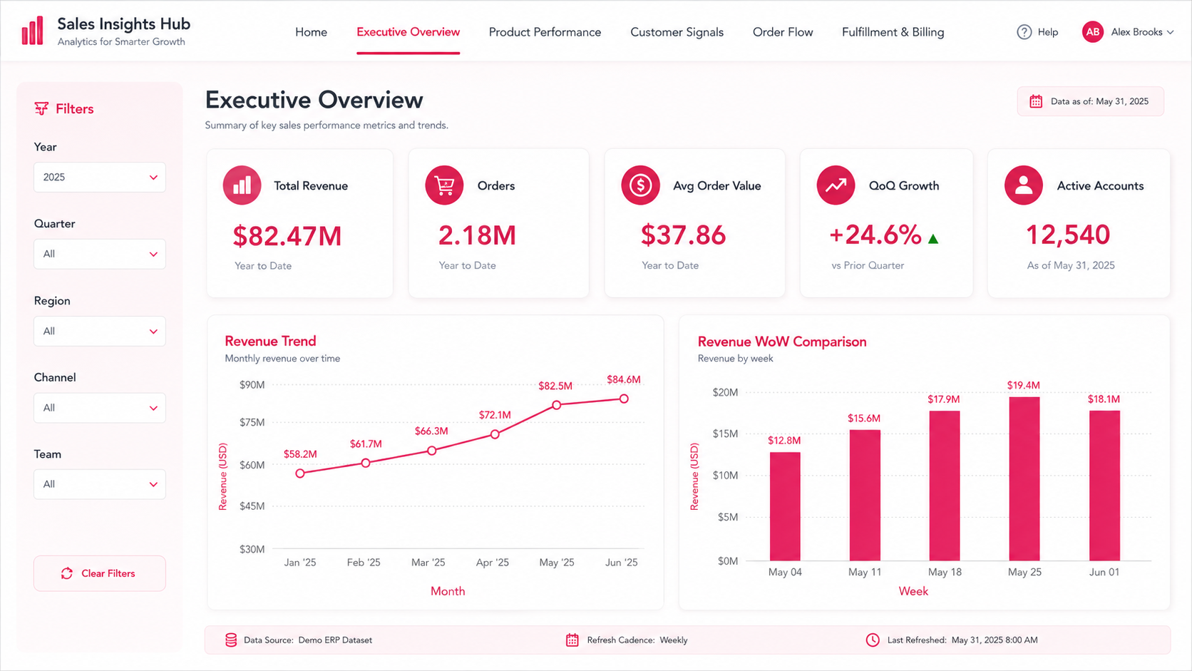
- Total Sales, net value
- Number of Orders
- Average Order Value per order
- Month-over-month sales growth
- Number of Customers
- Sales trend and week-over-week comparison
Filters for fiscal period, region, channel, and sales team sit alongside the KPIs rather than behind a menu, so the same screen answers both the headline question and the first follow-up: which slice of the business moved.
From Overview to Investigation
Each view answers one kind of question, with the chart that fits the decision behind it.
Product performance
Top-selling products, sales trend by representative, and product and plant level filtering, so a ranking can be read next to who is moving it.
Customer insights
Top customers by sales beside customer trend and purchase frequency, so concentration and buying rhythm are read together.
Order analysis
Order creation over time against ordered versus confirmed quantity, filtered by order status and rejection reason.
Fulfillment and billing
Billing quantity by product paired with delivery status, filtered by delivery block and ship-to party to isolate fulfillment issues.
Across all four layers the reporting grain stays the same: weekly, at product level by material description, sourced from SAP HANA and modeled in Power BI. Keeping the grain consistent is what lets a number seen in the overview be traced without redefinition into the view that explains it.
Designing for Self-Service Analysis
The same filters run through every view, so you never have to leave the dashboard to answer a question.
Fiscal period and week, sales representative, sales group, product and plant, order status, rejection reason, delivery block, and ship-to party are exposed where they are relevant. Filters persist as a familiar pattern rather than a per-page surprise, which is what makes the experience feel self-service instead of report-driven.
Overview
Filter
Compare
Drill down
Insight
Design Decisions
High-level KPIs come first, with deeper analysis organized by business area rather than by data table.
The same five-part structure persists across the experience, so orientation never resets.
Each view exposes only the filters relevant to the question that view is built to answer.
KPI cards, trend lines, rankings, and comparisons are chosen according to the type of decision the data supports.
Reflection
This project moved my thinking from individual charts to an analytics system. The harder work was structuring complex enterprise data, deciding what deserved priority at each level, and building a path that carries someone from a business question to an insight they can act on.
It also sharpened how I evaluate a dashboard: not by how much it displays, but by how quickly it answers the next question a user will have.