welcome to my court
Josephine KimProduct designer · Cornell Information Science · graduating Dec 2026
Ending the “Where Should We Eat?” Spiral
Designing a quiz-based mobile experience that helps Cornell students discover local Ithaca restaurants and make group dining decisions together.
The Problem
Cornell students want to try Ithaca's local food, but they keep ending up at the same places.
Students who eat out during the school year default to convenient or familiar options. Many are genuinely open to trying local restaurants, but those places are less visible than chains and it is hard to tell which ones fit a particular set of needs. Eleven of the fourteen Ithaca restaurants featured on UberEats are chains rather than locally owned, and downtown Ithaca saw double-digit business closures in 2020. Students lose out on the food scene, and small eateries lose out on customer flow.
The team narrowed this into two connected frictions.
Restaurant discovery
Students do not always know which local options fit their needs, and the information that would tell them is scattered across review platforms built for someone else.
Group decision-making
Choosing where to eat gets harder when several people's preferences, dietary restrictions, price expectations, and desired atmosphere all have to be reconciled at once.
Tastebuds
A mobile app that turns picking a restaurant as a group into a quick game.
Set parameters
Invite friends
Answer preferences
Get matches
Vote
Resolve ties
Winner
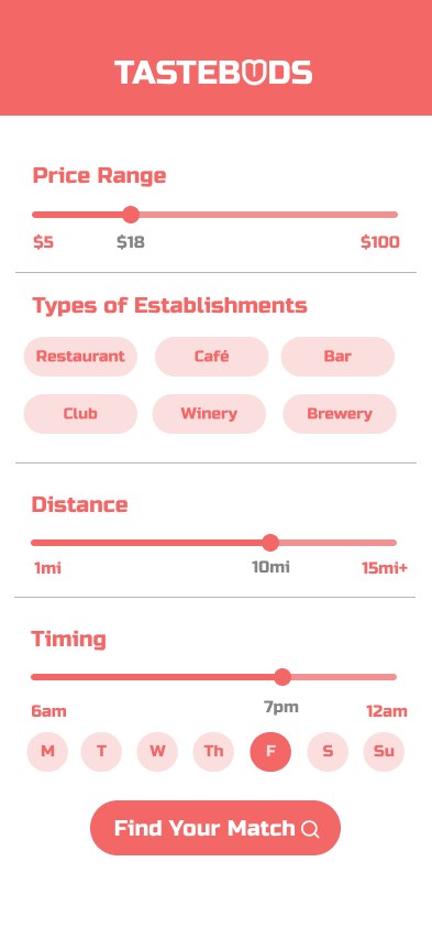
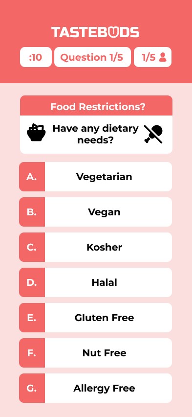
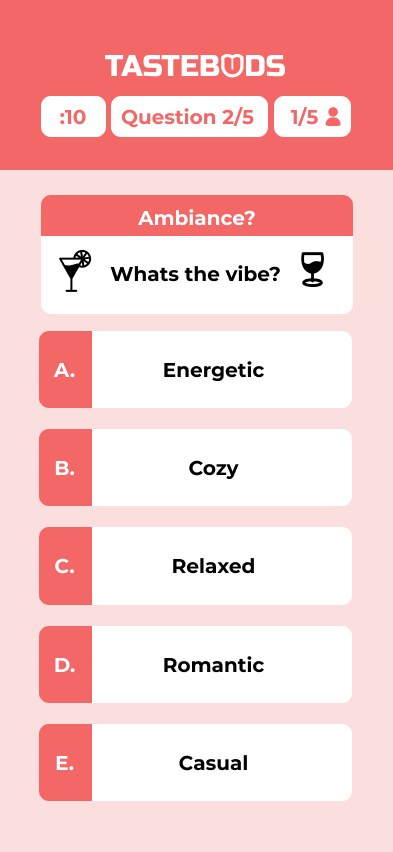
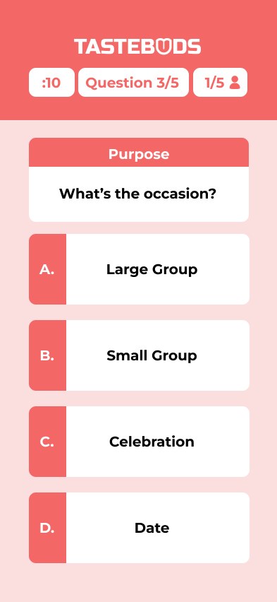
The host sets the constraints that apply to everyone: price range, establishment type, distance, and time of day. Friends join through a shareable session link. Everyone then answers five quick preference questions covering dietary needs, ambiance, occasion, cuisine, and amenities.
Tastebuds compares those combined answers against a database of small, local Ithaca restaurants, presents the three strongest matches, and lets the group vote its way to a single choice.
Planning the Project
This was a semester-long product project, with a lot more than UI in it.
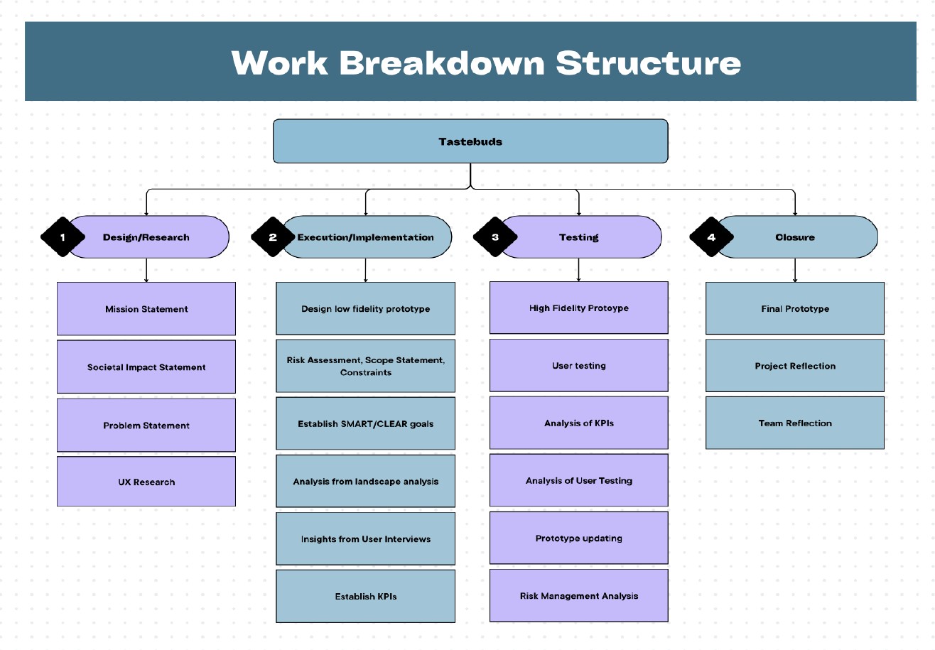
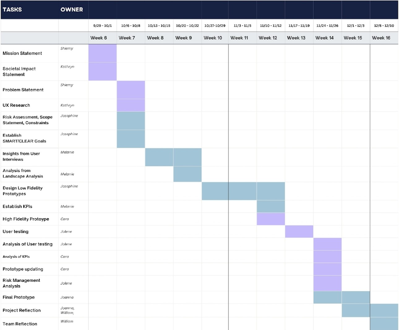
The team organized the work into four major milestones: design and research, execution and implementation, testing, and closure. A Work Breakdown Structure decomposed each milestone into actionable deliverables and clarified ownership. A Gantt chart then mapped those tasks across the semester so dependencies and parallel work streams were visible.
From Scope to Product
The hardest part happened before we designed a single screen.
The team initially framed the problem too broadly, and finalizing the problem statement became the most time-consuming stretch of the semester. Research, discussion, and planning eventually narrowed it to a single space: local restaurant discovery plus group dining decision support, for Cornell students in Ithaca.
Just as important was what the team chose not to build. Reservations, delivery, and payment processing were deliberately excluded so the prototype stayed feasible within the course timeline and the design effort stayed on the decision problem itself.
Designing the Experience
Four flows take a group from “idk, where do you want to go?” to actually walking to a restaurant.
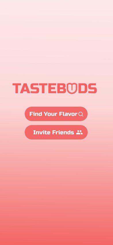
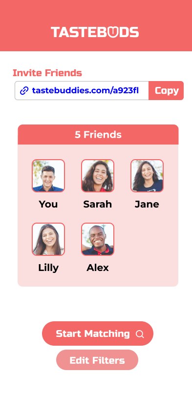
Flow A. Starting a session. The start screen offers two paths: find your flavor, or invite friends. Session settings then fix the constraints that apply to the whole group, and the invite screen turns a link into a visible roster of who has joined.
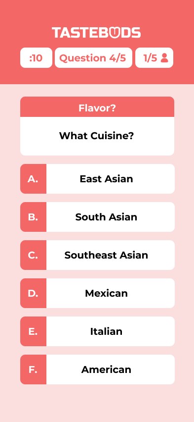
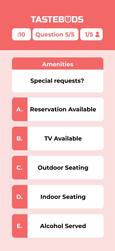
Flow B. Building the group's taste profile. Five questions translate a messy group conversation into structured preference data. A ten second countdown pushes the group forward, the question advances once everyone has answered, and a counter shows how many people have responded.
Flow C. Turning preferences into recommendations. An algorithm scores the Ithaca database against the group's combined criteria and returns the three closest fits. Each card carries the match percentage, star rating, description, address, phone number, operating hours, two popular menu items, relevant user reviews, and accept or reject voting.



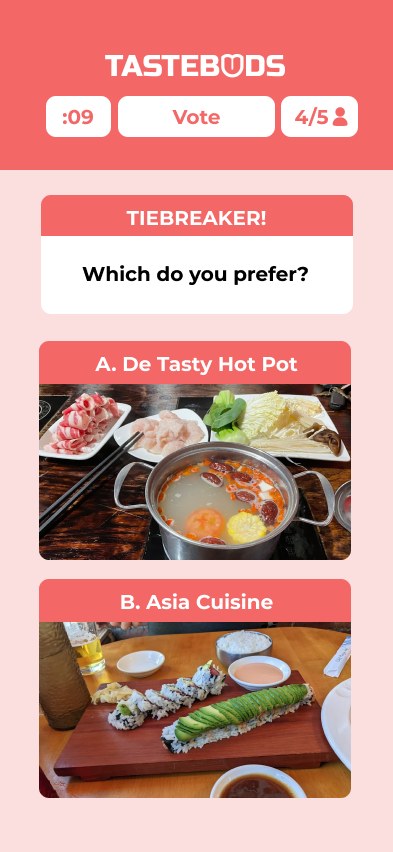
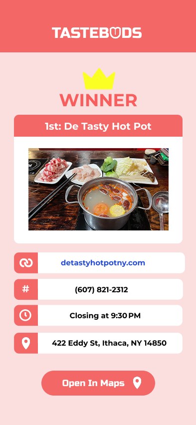
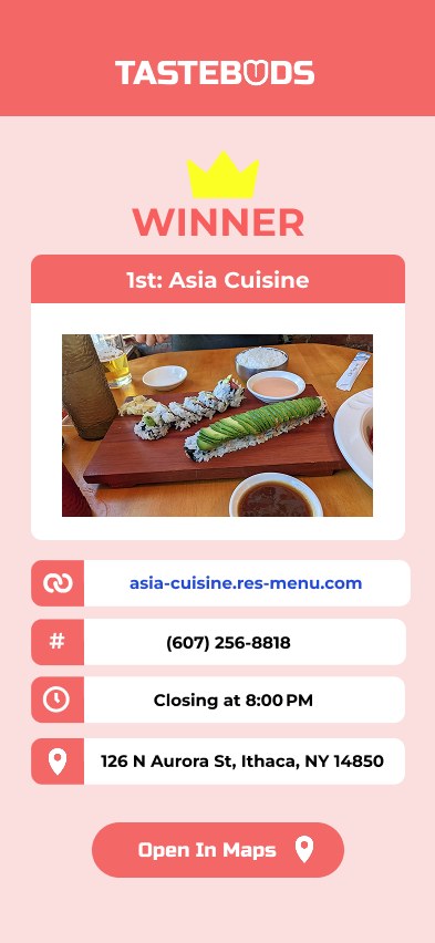
Flow D. Reaching a group decision. When multiple restaurants collect the same number of yes votes, a tiebreaker screen asks the group to compare the two finalists directly rather than restarting the process. The winning screen then surfaces the practical details needed to actually go: website, hours, phone number, address, and a link that opens the location in maps.
Testing the Experience
We ran task-based testing sessions with students in our target audience.
The team ran structured user testing on the medium-to-high fidelity prototype using a formal interview protocol: warm-up questions, six task-based usability steps, and a reflection section. Participants were representative of the target audience, which made the feedback about real dining behavior rather than hypothetical use.
What worked:
- Participants generally found the core flow intuitive
- The preference questions read as clear and understandable
- The concept of group decision support resonated
The sessions were not uniformly positive. Participants rated ease of use between 6 and 7 and visual appeal between 5 and 7.5, and likelihood of recommendation ranged from 2 to 6.5. They wanted more depth, better structure, and clearer guidance before they would recommend it.
Timer confusion
Participants questioned the purpose of the ten second countdown on the quiz questions.
Action clarity
The YES and NO interactions were not always immediately understandable, and their placement made voting feel uncertain.
Invite Friends hierarchy
Users wanted clearer labels, stronger button hierarchy, and better visibility into who had actually joined the session.
Match comprehension
Users wanted clearer match percentages and restaurant detail that connected visibly back to the answers they had given.
Visual hierarchy
Participants asked for stronger contrast and clearer guidance through the flow.
What Changed Because of Testing
Testing feedback went straight back into the design.
Users could not tell how well a restaurant actually fit the group
Match strength was present but visually buried
Surface the match percentage prominently as a percentage circle on each match card
Screens read flat and gave little guidance
Weak text hierarchy and low contrast
Strengthen text hierarchy and add color contrast for clearer visual understanding
Recommendations felt disconnected from the quiz answers
Nothing linked a result back to the group's inputs
Add filter tags and fuller restaurant information to each recommendation
Those responses are visible in the final screens above: the percentage circle on each match card, the filter tags summarizing why a restaurant surfaced, and the stronger color contrast carried through the flow.
My Contribution
I was on Design and Solutions, one of five roles on an eight-person team.
The team contract assigned me to the Design and Solutions function alongside Melanie Jalbert. The other functions were held by teammates: project management, research leadership, risk and data analysis, and writing and editing, which was shared across all eight members.
Everything described elsewhere on this page, including the research, the planning artifacts, the usability sessions, and the risk analysis, was team work carried out across those functions. My own responsibility sat with design and solution definition, shared with my Design and Solutions counterpart.
Reflection
Designing the product and managing the project ended up being the same problem from two sides.
Tastebuds moved from an ambiguous problem to a narrowed scope, a planned set of deliverables, a tested prototype, and a complete mobile experience. Watching that lifecycle up close made the dependency obvious: design decisions were only as good as the scope that framed them, and the schedule was only useful because it kept being revised.
- Define scope early, because ambiguity compounds into every later phase
- Treat testing as an input to design rather than a final validation step
- Balance user needs against real project constraints
- Design group decision flows where several people's preferences must be reconciled